Paid Membership Pro – Styling the Checkout Page
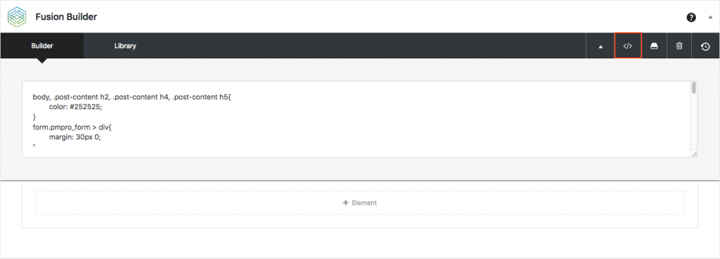
I use Avada Theme to design my website and Fusion Builder for page design. I place all my custom CSS for the style Paid Membership Pro Member Checkout form in the Fusion Builder custom CSS section (see the image below).
form.pmpro_form > div{
margin: 30px 0;
}
#pmpro_form .pmpro_checkout h3{
display: block;
font-size: 32px;
color: #fff;
background: rgba(26, 131, 190, 0.7);
padding: 15px;
}
.pmpro_checkout h3 span{
color: #fff;
margin: 10px;
}
hr{display: none;}

.pmpro_checkout-fields{
margin: 20px 0;
}
form.pmpro_form .pmpro_checkout-field{
width: 45%;
margin-left: 1%;
display: inline-block;
height: 35px;
}
.pmpro_checkout .pmpro_checkout-fields .pmpro_checkout-field label{
text-align: left;
margin-top: 15px;
}
form.pmpro_form .input{
font-size: 16px;
border-radius: 2px;
border:none;
border-bottom: 1px solid #1a83be;
}
form.pmpro_form .input:focus,
form.pmpro_form select{
outline: none;
}
form.pmpro_form .pmpro_submit{text-align: left;}
.pmpro_btn.pmpro_btn-submit-checkout{
font-family: 'Roboto';
font-size: 14px;
font-weight: 400;
padding: 13px 29px;
line-height: 17px;
text-transform: uppercase;
background: rgba(26, 131, 190, 0.7);
box-shadow: 0 3px 0 0 rgba(23, 115, 166, 0.7);
border-radius: 2px;
border: none;
color: #fff;
cursor: pointer;
display: block;
outline: none;
}
.pmpro_btn.pmpro_btn-submit-checkout:hover{
background: rgb(26, 131, 190);
box-shadow: 0 3px 0 0 rgb(23, 115, 166);
}
form.pmpro_form select{
width: 45%;
display: inline-block;
border: none;
border-bottom: 1px solid #1a83be;
box-shadow: none;
}
.pmpro_checkout-field.pmpro_checkout-field-username{display: block !important;}
.pmpro_checkout-field.pmpro_payment-cvv{clear: right;}


Thanks for this.
Works really well!
The problem I have now and before I found this post… is that my field labels on my checkout pages won’t show on mobile and are just blank…
Any idea how to fix this?
Thanks
Paul
This was great! I am trying to find out how I can change the “More information” title for checkbox.. also to make it mandatory to choose one.
Thank you, have been looking for something to change the submit button for a long time. I use Divi and this worked beautifully. I changed the colors and its magic.
Can’t thank you enough. Really appreciate it.