How to Create Separate Call To Action Button for Desktop and Mobile view in Divi Menu
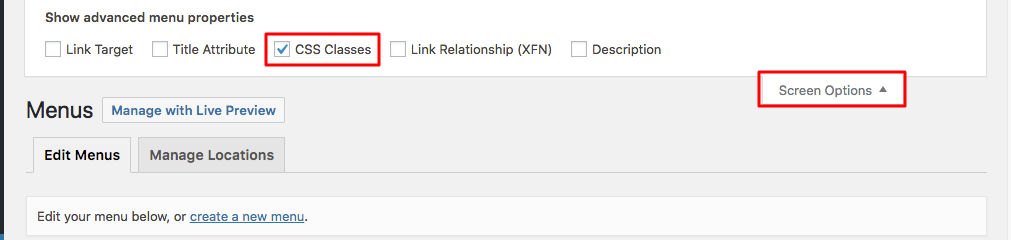
Appearance > Menus
Enable CSS Classes option from Screen Options
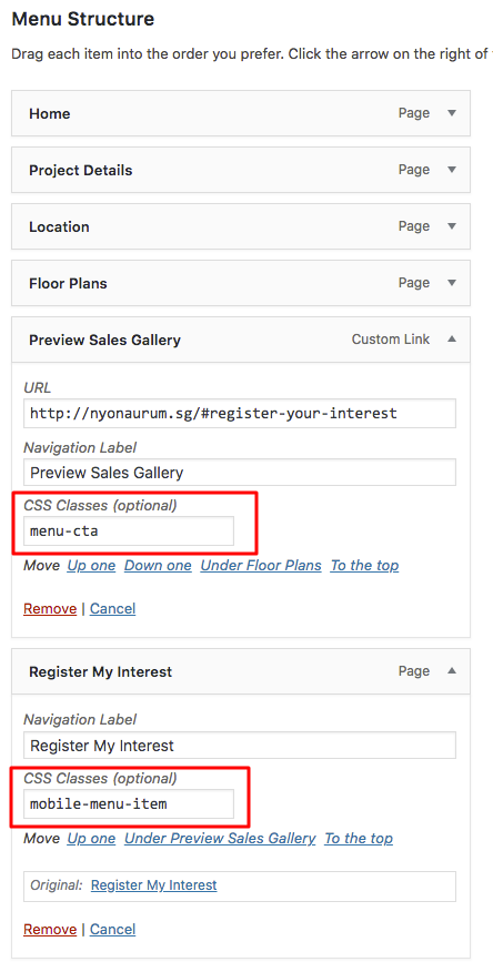
Add two Custom Link with CSS class “menu-cta” for Desktop CTA Button and “mobile-menu-item” for Mobile CTA Button
/*---------------Menu CTA Button---------------*/

.mobile-menu-item a,
.menu-cta a {
border: 2px solid #173F3B!important;
padding: 12px!important;
border-radius: 4px;
text-align: center;
color: #173F3B!important;
}

.menu-cta a:hover {
background-color: #173F3B;
color: white!important;
}

.et_header_style_left #et-top-navigation {
padding-top: 16px!important;
}

.et_header_style_left .et-fixed-header #et-top-navigation {
padding-top: 6px!important;
}

/*---------------CTA Button Color on Fixed Navigation---------------*/

#main-header.et-fixed-header .menu-cta a{
color: #fff !important;
}
/*---------------Menu CTA Button Mobile Settings---------------*/

@media only screen and (max-width: 980px) {
.menu-cta a {
background-color: #173F3B;
color: #fff !important;
}
}

/*---------------Custom Register Menu item for Mobile ---------------*/
#main-header .mobile-menu-item,
#main-header.et-fixed-header .mobile-menu-item{
display: none;
}
.mobile-menu-item a{
background-color: #173F3B;
color: #fff !important;
}
.mobile-menu-item a:hover{
background-color:#cbb583 !important;
color: #fff!important;
}
#mobile_menu .mobile-menu-item{
display: block;
}
#mobile_menu .menu-cta{
display: none;
}
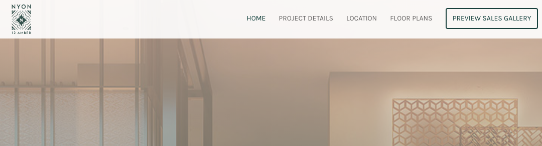
Desktop view
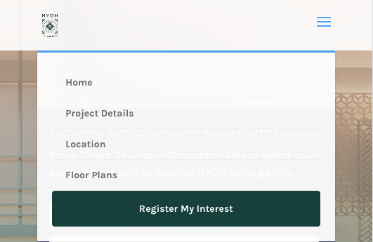
Mobile view


Tawfiqur,
Thanks for this, handled a clients requests perfectly.
Much appreciated!