How to Style Your Divi Blog Page into Two-Column Grid Layout
Add a Standard Section and insert a fullwidth column.
Click to edit the Section Settings and, under General Settings, change the following:
Under Custom CSS add the following:
CSS Class: tr_two_col
Save & Exit
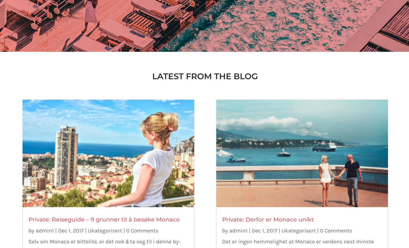
Implementing the Two-Column Grid Layout
By default, the blog grid has a three-columnn grid layout. To change this to a two-column layout, go to Divi → Theme Options and add the following CSS in the Custom CSS box:
@media only screen and ( min-width: 980px ) {
.tr_two_col .et_pb_column .et_pb_salvattore_content[data-columns]::before { content: '2 .column.size-1of2' !important;
}
.tr_two_col .et_pb_column .column.size-1of2 {
width:47% !important;
margin-right:6%;
}}
@media only screen and ( max-width: 980px ) {
.tr_two_col .et_pb_column .et_pb_salvattore_content[data-columns]::before { content: '2 .column.size-1of2' !important;
}
.tr_two_col .et_pb_column .column.size-1of2 {
width:100% !important;
margin-right:0%;
}
}
Now your grid should be two columns for any screen size bigger than 980px. For screens, less than 980px the grid will change to a single column.


Worked perfectly! Thanks for the great tutorial.
Tawfiqur / Mary
I can’t seem to get this to work correctly, any help?
this is the page I am trying to style:
https://stage.dreamsyndicate.com/projects/
thanks
lk
Thank you for this tutorial! Unfortunately it’s not working like it’s supposed to with me. The total width of 47% and 6% makes the second column get under the first. When I change the margin to 3% they do stay in one row, but there still is a margin on the right side. I hope you can help me out?
Thanks
Hi. I implemented this using a 5 column. It’s working. The challenge however is to make this two column on iphone view. Any code to implement in addition to the above?
So meaning, on desktop and on ipad, it’s 5 column, but on iphone, I need it to be only 2 column. What’s needed?
Hello Vince,
To get a 2-column layout on iPhone you need to change the max-width value of the following code. For example,
@media only screen and (max-width: 768px){
.tr_two_col .et_pb_column .et_pb_salvattore_content[data-columns]::before { content: ‘2 .column.size-1of2’ !important;
}
.tr_two_col .et_pb_column .column.size-1of2 {
width:100% !important;
margin-right:0%;
}
}
you can try 375px also. let me know if it’s worked for you or not.
Thank you.